Men’s adventure magazines of the 1950s, 1960s and early 1970s have a special place in the history of illustration art.
The artwork they used was a more modern incarnation and evolution of the pulp art covers created for classic pulp magazines from the early 1900s until about 1950, when the classic pulps finally faded away and the men’s postwar pulp magazine genre fully emerged.
In fact, many great pulp illustration artists who created covers for pre-World War II pulp magazines went on to provide cover and interior art for the postwar men’s pulp mags.
Men’s adventure magazines also helped keep alive the tradition of painted covers and interior art after the classic pulps disappeared and the mainstream magazines, which had also featured painted covers and illustrations for decades, switched to photos.
Some people may look down on the cover art and illustrations used for men’s adventure magazines.
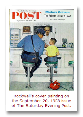
But they are actually very similar to — and often as good as or better than — the artwork done for mainstream magazines, the best known of which are probably the celebrated cover paintings that Norman Rockwell created for The Saturday Evening Post.
They are part of a general school of 20th Century American realism art that was used for slick and pulp magazines, hardcover book dust jackets and illustrations, pulp paperback covers, advertisements and some comic book covers.
It’s a type of painted art that looks realistic in its depictions of people and settings, whether the scenes involved are based on reality or fantasy.
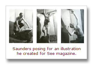
To help make their art look realistic, many of the best illustrators of that era worked from photographs they staged and shot themselves. This technique was used by both mainstream artists like Norman Rockwell and by pulp art masters like Norman Saunders.
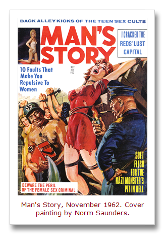
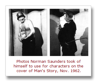
At right are photos Norman Saunders took of himself and used for two characters in his cover painting for the November 1962 issue of Man’s Story (shown at the top of this post).
These photos come from a chapter written for the book It’s a Man’s World by Norman’s son David Saunders, who is himself an acclaimed artist.
In that chapter, David notes:
“Dad preferred to paint from observation of actual objects, so he would arrange elaborately staged setups for his models and shoot Polaroid snapshots to refer to while he painted. He always used dramatic theatrical lighting, with colored filters for their illusive effects. Many paintings featured a ‘hot light’ (red, orange or yellow ) glowing on one side of the object and a ‘cold light’ (purple, blue or green) shining on the other side. This ‘hot-to-cold’ color scheme was a traditional technique for adding dimensional depth to a painting. ‘Cool’ colors seem to move away from the viewer, while ‘hot’ colors appear to confront the viewer’s eye, but Norm intensified this principle to make his illustrations more eye-catching.”
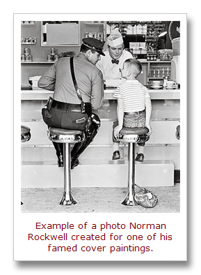
I was reminded of Norm Saunders’ use of photos recently when I saw Norman Rockwell: Behind the Camera. This new book, written and compiled by Ron Schick, focuses on the carefully staged photographs that Norman Rockwell created for his magazine cover paintings.
Norman Rockwell had a much bigger budget for the photos he created for his artwork than Norm Saunders. And, of course, their topics were light years apart. But their use of photography was similar. And, although Rockwell’s topics were generally mild and Saunders’ were generally wild, they were both American realists.
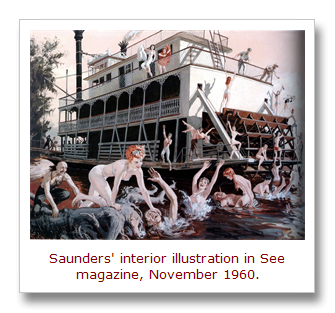
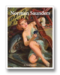
There are some other examples of Saunders’ use of photos in the great book about his art, titled simply Norman Saunders. (An example used for See magazine in 1960 is shown below.)
In this awesomely beautiful book, David Saunders provides a retrospective of his father’s work, from the paintings he created for the pre-war pulps and postwar men’s adventure magazines to his famed Mars Attacks trading cards. It’s a must-have book for fans of illustration or pulp art in general and for Norman Saunders fans in particular.
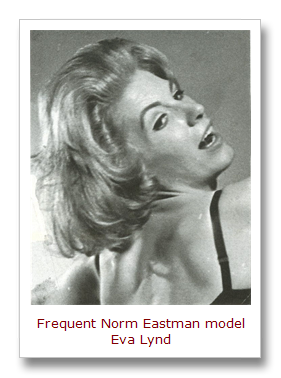
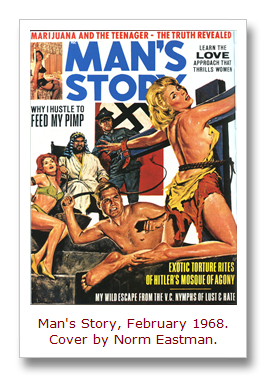
By the way, another vintage illustration artist named Norm — Norm Eastman — also used photos of models and himself. As noted in previous posts on this blog, Eastman was the master of the Nazi bondage and torture subgenre of men’s pulp magazine cover art.
Here’s an example showing a photo that Eastman took of one of his favorite female models, Eva Lynd. He used this to paint the tortured damsel on the cover of the February 1958 issue of Man’s Story. (The photo is from the out-of-print 2004 edition of Men’s Adventure Magazines In Postwar America, which has a chapter about Eastman that is unfortunately omitted in the new 2008 edition.)
Dare I compare Norm Eastman and Norman Saunders to Norman Rockwell?
Well, yeah. I do and just did.
And, personally, I like the wild artwork created by Saunders and Eastman better than the mild stuff created by that other, more famous Norm.
Comments? Questions? Join the Men’s Adventure Magazine Facebook Group.
|


