
Simply put, Samson Pollen was one of the greatest of the many artists who provided illustrations for the men’s adventure magazines (MAMs) that flourished from the early 1950s to the late 1970s.
My publishing partner Wyatt Doyle and I had the good fortune and the honor of working with Sam on two books featuring his artwork before he passed away in December of 2018.
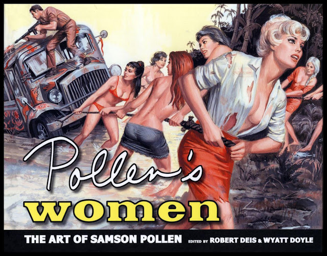
The first, POLLEN’S WOMEN: THE ART OF SAMSON POLLEN was published last year. It quickly became one of the best-selling books in our Men’s Adventure Library series, which features classic MAM stories and artwork.
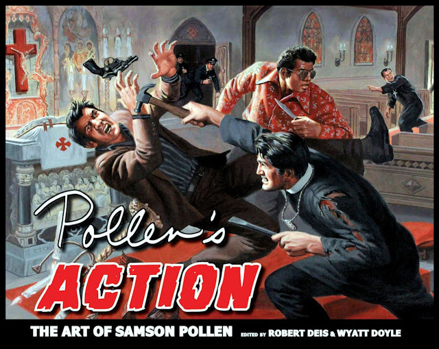
The second, POLLEN’S ACTION: THE ART OF SAMSON POLLEN, was released on January 1, 2019.
Both books are available on Amazon and Barnes & Noble. They’re also available via the Book Depository site, which offers free shipping worldwide.
Both books feature full color reproductions of dozens of original men’s adventure mag paintings Sam created, and scans of the story spreads and covers they were used for.
Each book also includes exclusive interviews with Sam and introductions by me.
Although many MAM and paperback cover artwork fans know his work, there is surprisingly little biographical information about him on the internet.
Our collaborations with Sam are the first studies of his life and work and, since he granted us access to scores of his original MAM and paperback artwork and spoke with us extensively about his life and career, they won’t be the last.
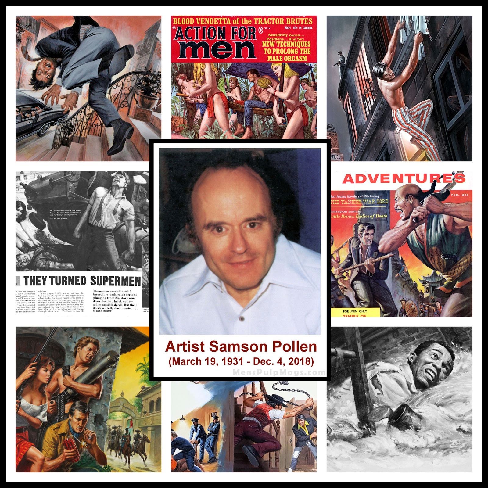
Samson Pollen was born in the Bronx on March 19, 1931. His family moved to Brooklyn when he was 11.
From an early age, he showed a talent for artwork. This talent was noticed by a high school teacher who helped him get enrolled at the venerable National Academy of Design in Manhattan. There, he was taken under the wing of the school’s dean, Charles Louis Hinton, a legendary painter, sculptor, book illustrator and muralist.
After studying at the Academy and graduating from high school, Pollen got a job as an apprentice at the Wittrup-Patterson art studio in New York, owned by top commercial art illustrators Jack Wittrup and Robert Patterson.
When the Korean War broke out in 1950, he joined the Coast Guard Reserve and was stationed in New York.
When his superiors became aware of his artistic talent, they asked him to do illustrations for the official Coast Guard magazine. By the end of his tour of duty, he was offered a cushy post in the Coast Guard art department if he’d re-up. He decided instead to try to become a professional illustration artist.
In the early ’50s, for someone with Pollen’s talent, this was not an unrealistic goal. The magazine and paperback markets were booming, and New York City was the headquarters for most top publishers. It was also where most top magazine, book, and advertising illustrators lived and worked.
Over the next forty years, Sam went on to create scores of classic covers for action/adventure, mystery, crime, romance, and young adult novels.
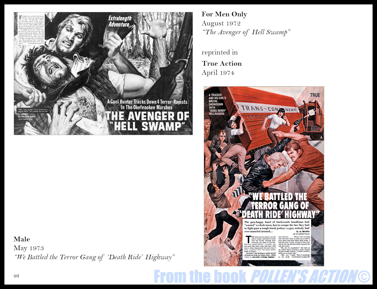
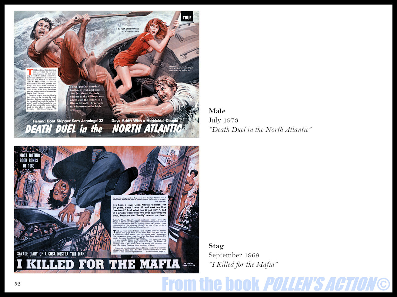
But from the mid-’50s to the late ’70s, the majority of Pollen’s illustration assignments came from men’s adventure magazines. Most of them were for MAMs published by Martin Goodman’s Magazine Management company.
Magazine Management is now most widely known for giving birth and a robust early life to Marvel Comics. What is less well known today is that, through various subsidiaries, it published many of the best and longest-running MAMs.

Goodman’s published his first MAM title, STAG, in December 1949. He launched another, MALE, in June 1950. Both sold well. In 1952, Goodman created MEN. In 1954, he launched FOR MEN ONLY. Every year or so during the ’50s and early ‘60s, he tried publishing new variations on the men’s adventure format.
In the early 1950s, they were published with an “Atlas” logo on their covers, reflecting the name of the Goodman-owned company that distributed magazines and paperback books he published to newsstands. In 1958, after Goodman dissolved the Atlas company, Magazine Management began calling its MAMs the “Diamond Group” of men’s mags and used a special diamond-shaped logo to identify them. The four flagship Atlas/Diamond MAMs, STAG, MALE, MEN and FOR MEN ONLY, ran through the late 1970s, then were sold and turned into Hustler clones.
Other Atlas/Diamond MAMs that had varying lifespans between the mid-’50s and late ’70s include: ACTION FOR MEN, ACTION LIFE, ADVENTURE LIFE, ADVENTURE TRAILS, BATTLEFIELD, COMPLETE MAN, FISHING ADVENTURES, HUNTING ADVENTURES, KEN FOR MEN, MAN’S WORLD, MEN IN ACTION, REAL LIFE, SPORT LIFE, SPORTSMAN and TRUE ACTION.
Mag Management’s Atlas/Diamond MAMs became an important source of income for scores of writers and artists. However, the list of artists who worked for them from the early ’50s to the late-’70s and created the majority of illustrations for them is fairly short. They include Gil Cohen, Charles Copeland, Mort Künstler, Bruce Minney, Earl Norem — and Samson Pollen.
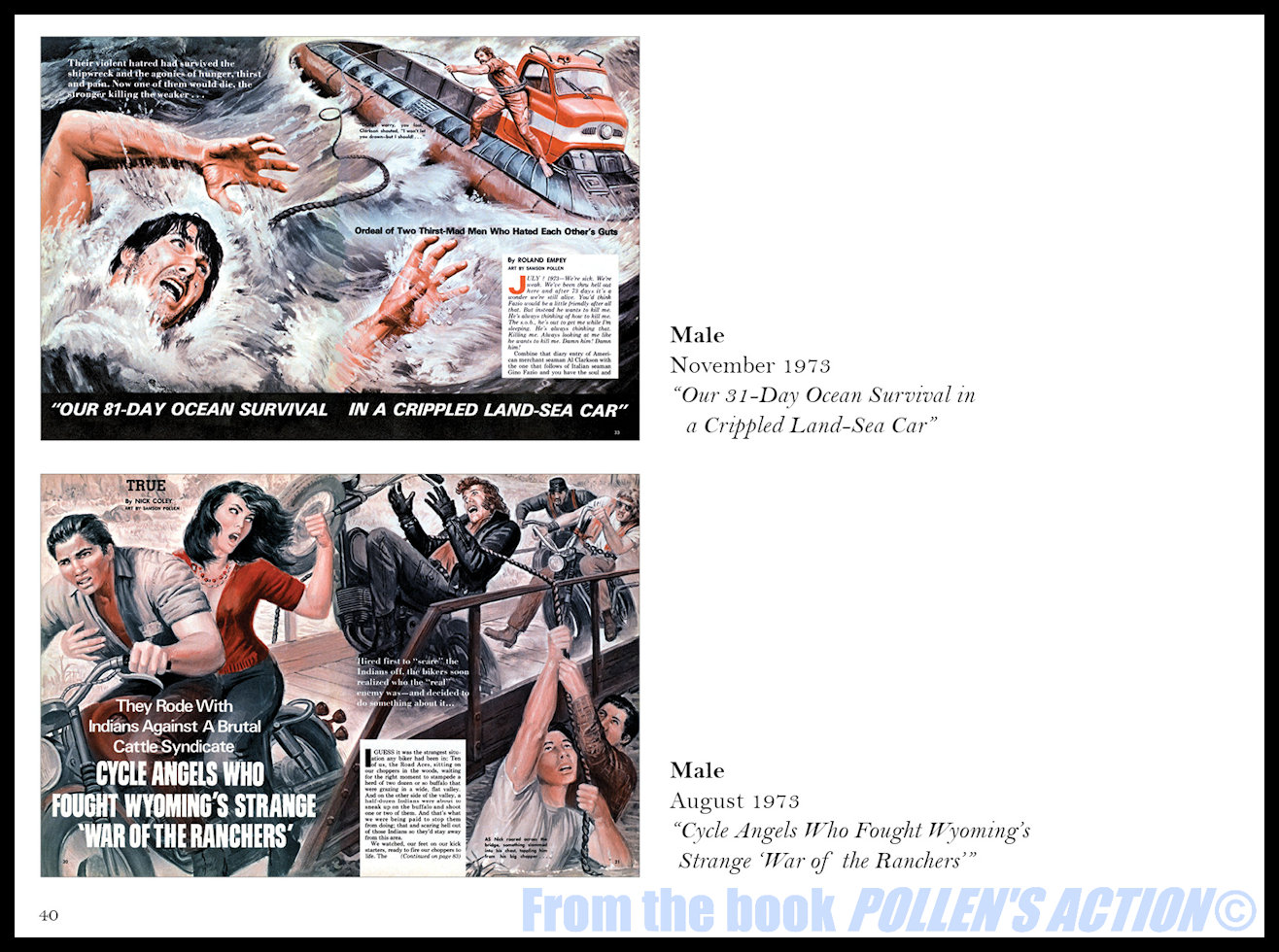
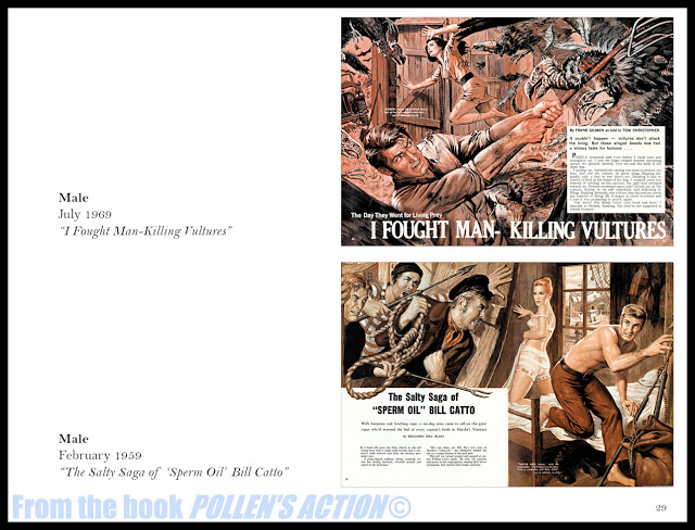
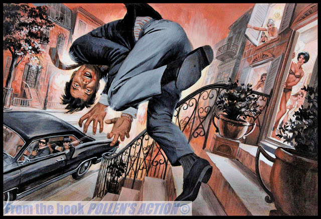
Illustrations by Pollen appeared in all but a few of the shortest-lived Atlas/Diamond MAMs. Most are interior illustrations. Sam created many paperback novel cover paintings during his long career as an artist and a few magazine covers, but when working for magazines, he preferred interior illustrations.
Most Atlas/Diamond MAM interiors were painted and printed in black-and-white or as “duotones” (shades of black, plus shades of a single color). In the ’50s and ’60s, only a small percentage were in full color. Full color became more common in issues published in the ’70s, as advances in printing technology made it more affordable. But even in those years, black-and-white and duotones were more common in the Atlas/Diamond MAMs.
Sam Pollen didn’t mind. In fact, as you’ll read in POLLEN’S ACTION, he preferred black-and-white and duotones over full color. He felt they allowed him to focus more on the composition and storytelling aspects of a painting.
“I liked doing the interiors,” Sam told me. “I never really went for the covers. On the interiors, I could focus on the composition and the story I wanted to tell in the painting. When you do a cover it’s a completely different approach. I was doing enough covers on paperbacks, so I didn’t want to do men’s adventure magazine covers. I did do a few, but most of my cover art was for paperbacks.”
Sam said never read the stories he illustrated. In fact, I know from other MAM artists I’ve interviewed for my MensPulpMags,com site, such as James Bama, Gil Cohen, Basil Gogos, Mort Kunstler and Bruce Minney that most didn’t. They didn’t have time. They were too busy meeting deadlines for magazine and paperback artwork.
Art Directors would give them a short synopsis a few sentences long and, in some but not all cases, and idea of the scene they wanted painted and delivered — usually within a week or less. The rest was left to the artist, his imagination and his talent. Sam Pollen had an abundance of both.
Many of the stories and “book bonus” adaptations Pollen illustrated were written by notable writers, including:
- Mario Puzo, author of The Godfather; whose MAM stories were often credited to the pseudonym Mario Cleri (an example is on page 73 in POLLEN’S ACTION);
- Donald Westlake, the prolific and popular novelist who penned darker crime fiction as Richard Stark (see page 15);
- Norman Mailer, the famous (and infamous) man of letters (see page 108);
- Richard Wright, pioneering African American writer (see page 123);
- Don Pendleton, creator of the popular Mack Bolan/Executioner novel series (see page 14);
- Walter Kaylin (see pages 26 and 36), perhaps the ultimate MAM writer, who often wrote under the pseudonym as Roland Empey and whose work is featured in our HE-MEN, BAG MEN & NYMPHOS anthology (see pages 42, 86, 87, 90, 98, 103 and 126);
- Robert F. Dorr renowned military aviation writer, whose MAM stories are featured in our anthology A HANDFUL OF HELL (see page 66); and
- Other well-known writers such as Martin Cruz Smith, later famous for GORKY PARK and other novels, Evan Hunter, best known for the 87th Precinct novels written as Ed McBain, and Erskine Caldwell, the popular author of racy paperbacks.

Pollen’s illustrations were always at least as good as — and often better — than the stories themselves, even in the case of those penned by notable writers.
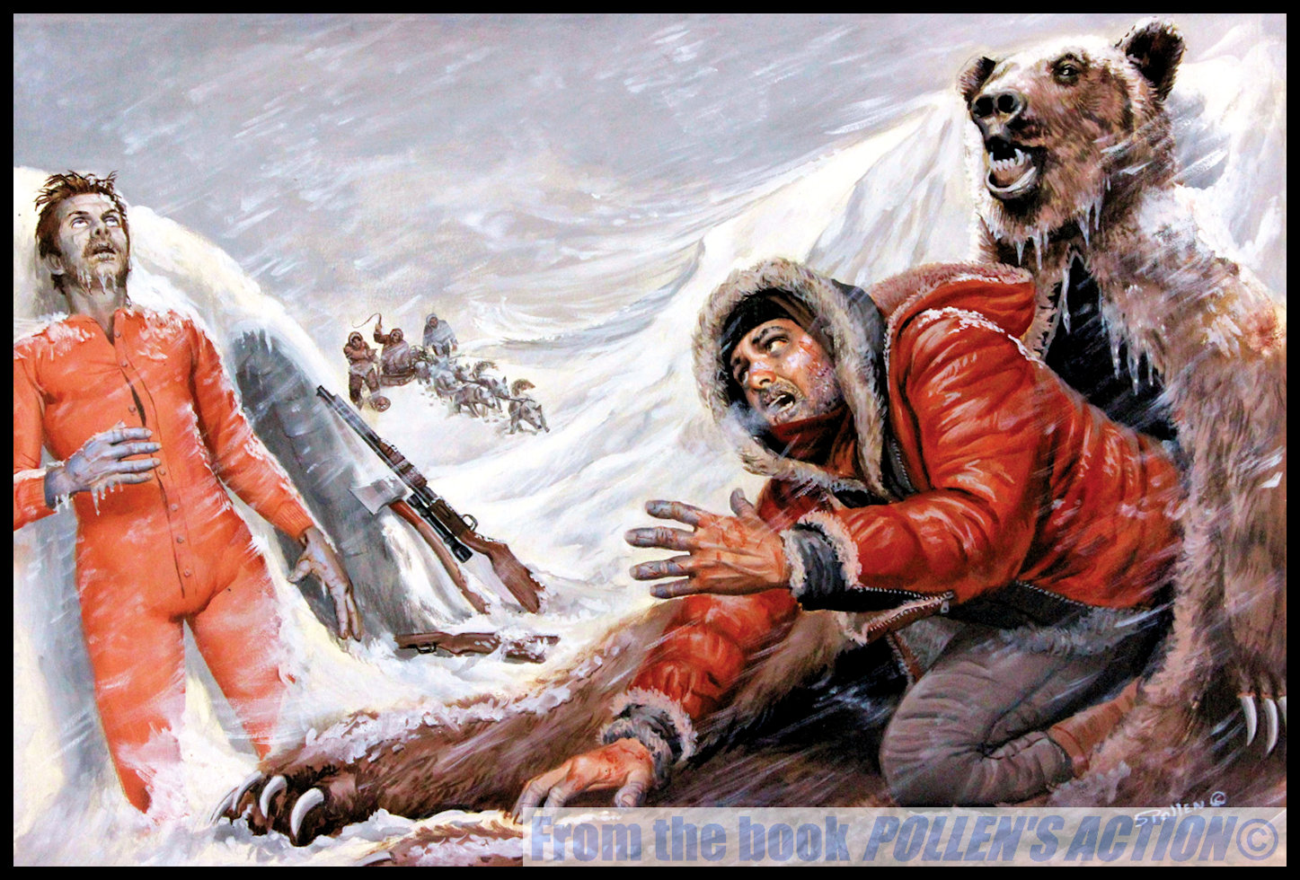
The style Pollen used for his men’s adventure magazine artwork changed over the three decades he worked for the genre. When he first started working for the Goodman mags in the 1950s, he used the fairly photorealistic style that was common in illustrations at the time. Sort of Norman Rockwell light.
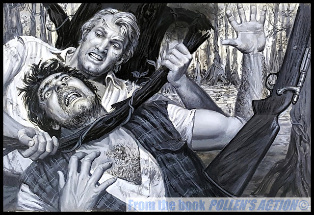
During the course of the ‘60s and ‘70s, his style became looser. He focused more on how he composed the various elements of a scene and how he could make it a dramatic image that told its own story, less on photorealistic rendering of faces and details
As my co-editor eloquently put it:
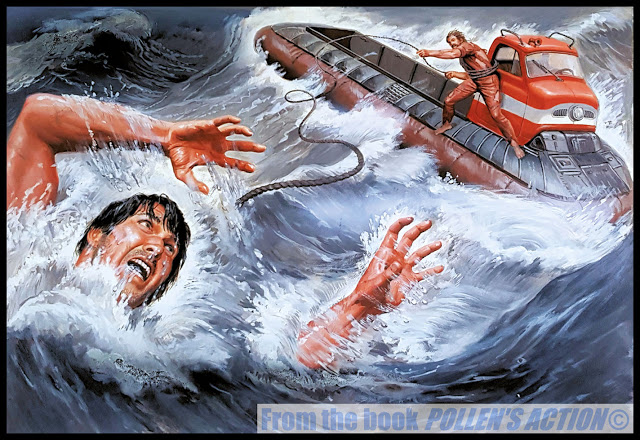
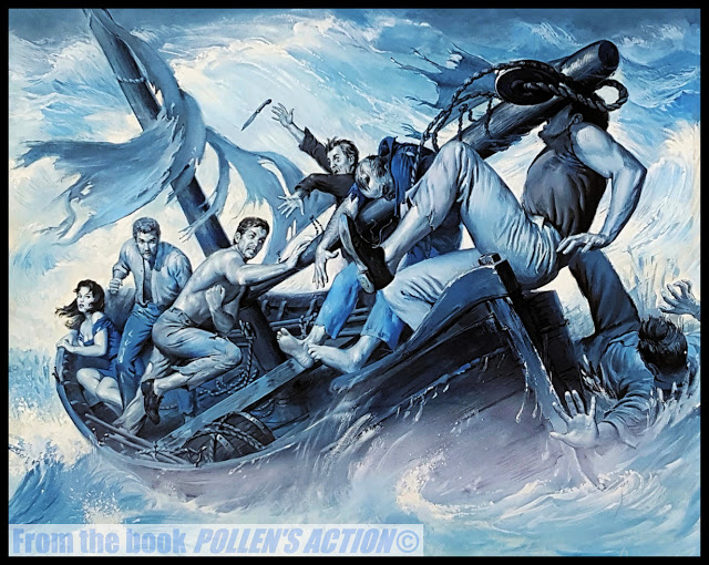
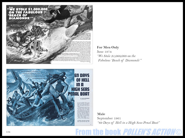
“Pollen’s earliest MAM work in the ’50s reflected his slightly more mannered paperback covers of that era, painted in a more photorealistic style common at the time. But the challenge of depicting motion interested him, and unlike the portrait-driven work of his early paperbacks, the requirements of MAM illustration afforded him the opportunity to explore that interest, full tilt. His duotone illustration for “69 Days of Hell in a High Seas Penal Boat” (pg. 122) from the September 1961 issue of Male, for example, retains elements of formality in his approach, but the scope and intensity of its action (and its use of 3-D perspective) would all be hallmarks of his later, looser style. Like most Pollens, there is a lot going on, and the more you look, the more there is to see. Each component contributes to the illusion of motion, from the curl and swoop of the watery tempest to the tilt, angle and lines of the small boat expressing the dip, rise, and toss of the waves. Even the four figures struck by the ship’s boom offer a visual prompt for the subconscious; divided into panels, they might represent the sequential progress of any one of them, stage by stage from smackdown to splashdown…There is a lot of invention in Pollen’s chaos.”
When you look at the original paintings shown in POLLEN’S ACTION and in our previous collection, POLLEN’S WOMEN, you’ll see that even without the tales they were painted to accompany, these images tell compelling stories. They also stand alone as cool examples of 20th Century illustration art.
 Today, Sam’s original MAM paintings sell for prices as high as $5,000 to collectors of such art.
Of course, snooty critics don’t consider them to be “fine art.”
And, that reminds me of the old joke known to insiders in the art world.
What’s the difference between a fine artist and an illustrator?
Answer: An illustrator can draw.
Samson Pollen could draw — and he drew and painted the hell out of every illustration he created.
He passed away in Manhattan on December 4, 2018 at age 88, from natural causes, not long after he saw and approved a proof copy of POLLEN’S ACTION.
We were immensely pleased when Sam told us he loved the book.
We’re glad he got to see it. A few days later, he died.
I loved having the chance to know and work with the great Samson Pollen. I know Wyatt did, too.
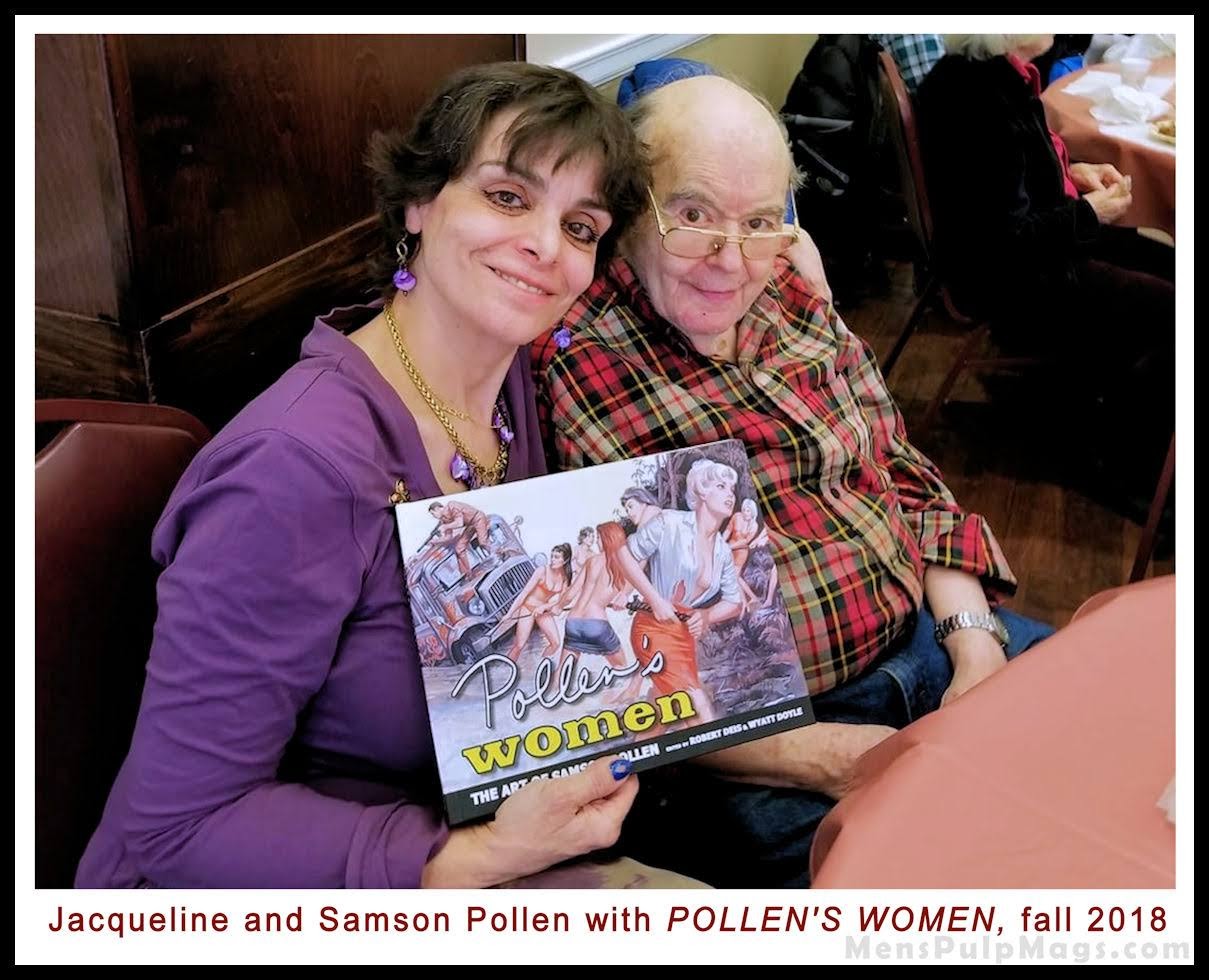
And, we’re both grateful to him and his beautiful wife Jacqueline for their enthusiastic support of our efforts to keep his artistic legacy alive.
Comments? Corrections? Post them on the Weasels Ripped My Book Facebook Page, email them to me,
or join the Men’s Adventure Magazines & Books Facebook Group and post them there.
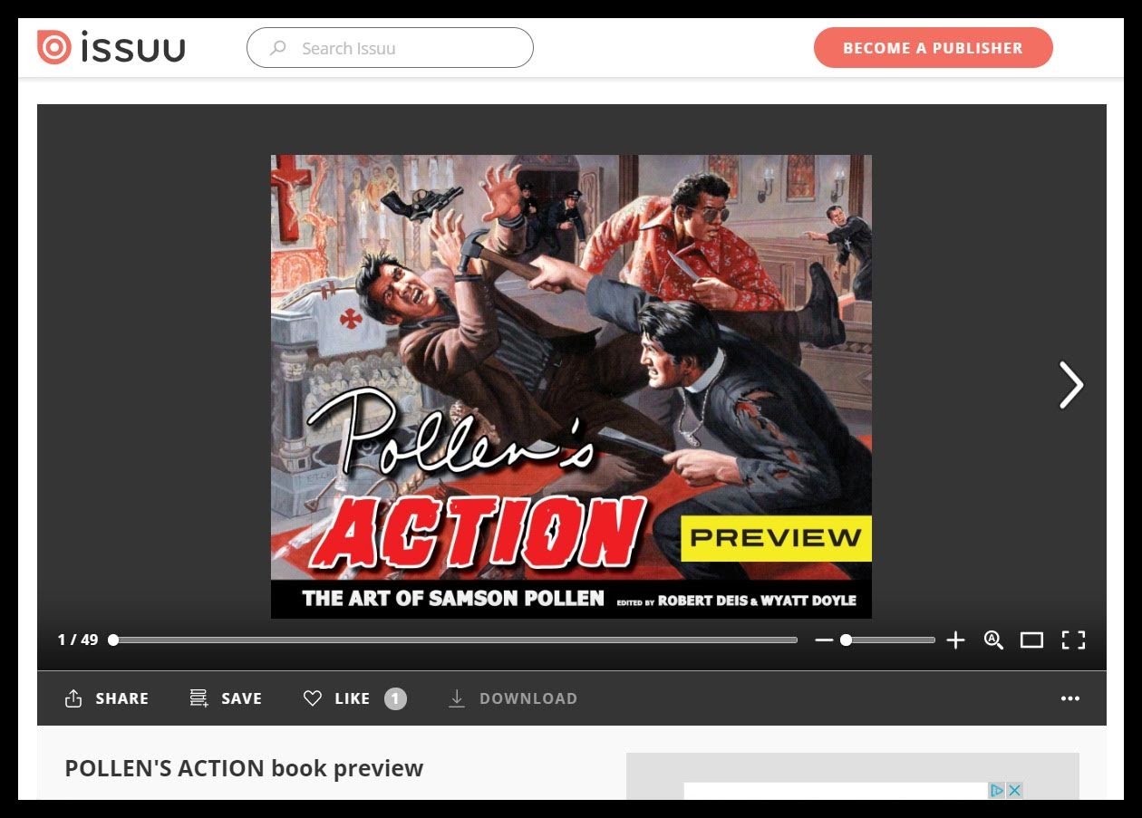
To see an extensive flip-page preview of